JOURNAL
documenting
&
discovering joyful things
8 things I loved at the Grand Designs Live Home Show
I am super grateful to the folks behind the Grand Designs Live Home Show in Melbourne for sending me tickets to this event on the weekend. Here are eight things I spotted at the show that I really wanted to spend my (sadly non existent) money on.
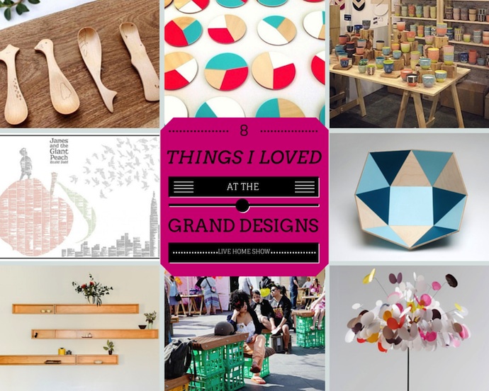
Clockwise from top left: This sweet set of four animal wooden spoons from Anrol Designs :: Painted geometric coasters from Amindy :: Hand carved and painted stoneware cups from Koa :: Lightweight, wooden K bowls, from Eco Wood Design :: An "eyoi yoi" table lamp (I used to have an eyoi yoi floor lamp that I loved) from Marc Pascal :: Humble milk crate tables & chairs made lovely with wooden tops, from Sawdust Bureau :: Shadowbox shelving from Cantilever Interiors :: An image created from the text of an entire book, from Spineless Classics
(A little note about the pics: I did take my camera along to snap photos while I was there, but the combination of limited natural lighting plus the wearing of a toddler in the Ergo did not a steady hand nor pretty picture make. So to do these lovely products justice, I've used images from the makers' or vendors' websites.)
It feels like home when...
 Ours was a chilly and sometimes wet weekend, tailor-made for staying home. For jaffles and baking and craft and family dance-parties. Madeleine hosted her very first slumber party, with one of her cousins, and you have never seen a two-year-old more excited. She quite literally jumped for joy at the prospect of it, and the reality sent her into a frenzy that was so extreme she could barely contain herself. At one point as we sat around the table having dinner with her aunty and uncle and two cousins, already an hour past her bedtime, Madeleine repeatedly kissed me on the lips. Not for any reason, except, UNCONTAINABLE EXCITEMENT.
It is on weekends like this that our house comes into its own. When squeals of laughter bounce off the walls and little feet thump-thump-thump down the hallways. When the kitchen smells of toasted cheese and chocolate cake, and tiny fingers reach up to trace circles in spilled flour on the bench.
Half-wilted flowers grace an old jar on the dining table: they were carried home in sweaty palms by my beautiful daughter and niece after a coffee-run with Mr B, and thrust at me with so much pride.
There are many things I love about my home and, of course, many things I would change and many things we have yet to do. That's what happens when nesting and budgeting go hand in hand, I guess. But the thing I absolutely love most about my home, towering above everything else, is having a place from which to welcome the people we love. Even with no pictures on the walls, and so much left to do, my house feels like a home because I am able to make others feel at home here too.
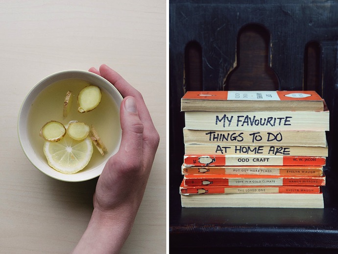
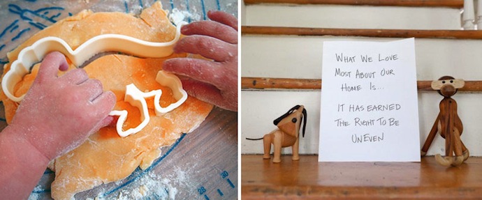
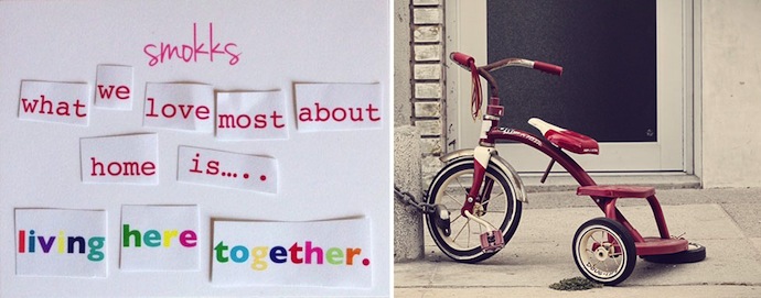
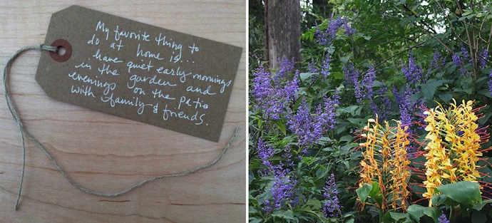
Do you ever read design blog Design Sponge? It's a favourite of mine. One of the regular features, called "Spaces," opens up beautiful homes from around the world. In each post, the home-owners (or renters) are invited to share something they love about their home, or their favourite thing to do or place to be within their home. I find it really interesting to read this. We are all so different, and yet there are definite themes that emerge.
What about you? What do you love most about your home? What do you like to do most in your home?
Photo credits: all images of “home notes” are used here with kind permission from Grace Bonney at Design Sponge. See the homes they come from at (from top) 1 // 2 // 3 // 4 // 5, or click on the photos themselves. All other photos are either mine or licensed for unlimited use under Creative Commons. They do not relate to the homes in the comments.
Renovation update - a blank canvas
 It sure has been a long time coming, but here is my first post about renovating our home a couple of months ago. Thank you to everyone who has shown enough interest to ask, and thank you for your patience! (Here was my original post announcing this renovation. Oh, the optimism!)
A blank canvas
This is not really a "before and after" story, since there's till a long way to go: we're more at the "before and three-quarters" stage. That is to say, our home is a blank canvas. The bones are complete, and we are all moved in, but a lot of the character is still to come. There are very few paintings on the wall, or cushions on the couches, or plants under sunny windows. You never know. Perhaps I'll write a proper "after" story of this house to include all those things, one day.
Ours wasn't a big renovation per se. We weren't adding or removing any rooms, it was more of a cosmetic update. New bathrooms and kitchens, fresh paint on the walls. Pulling up the old carpet to expose the original floorboards. That kind of thing. Simple and affordable, yes?
But of course we managed to trip over every cliche you've ever heard of to come with renovating a house that is more than a century old. The work took twice as long as we had anticipated, and almost twice as much as we had budgeted. There were problems with builders and tradesmen and even now, more than eight months after we started, we are still waiting on some little jobs while other small problems require fixes.
So you can blame the cliches for the blank canvas state of our home right now. Essentially our entire decorating and pulling-together budget (and a hefty sum over and above that) was spent, instead, on scope-creep that we probably should have anticipated. You can read the story of all that happening (and see some scary photos of the work in progress) here. Actual walls made out of straw, anyone?
And now for today's reveal: the lounge / dining room
This is what it looked like before we started. Can you believe Madeleine wasn't even walking at that point? What a little no-haired cutie!

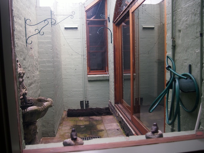
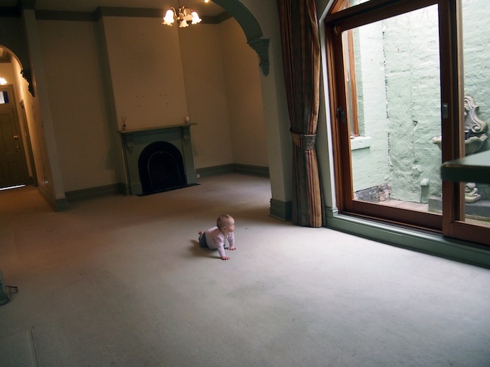 Now, here is what we did to those two rooms and the hall:
* Removed the hideous decals from the walls and windows * Painted the walls, doors and ceilings * Replaced the light fittings * Replaced the locks, door handles, light switches and power points * Removed the carpet * Failed to rescue the original floorboards, replaced them with new boards * Discovered the floor joists underneath were rotten, so replaced them too * Replaced the window dressings * Re-tiled both fireplaces * Removed the mouldy cement water-features from the light well * Painted the light well * Installed a decking in the light well at floor level with the inside floor
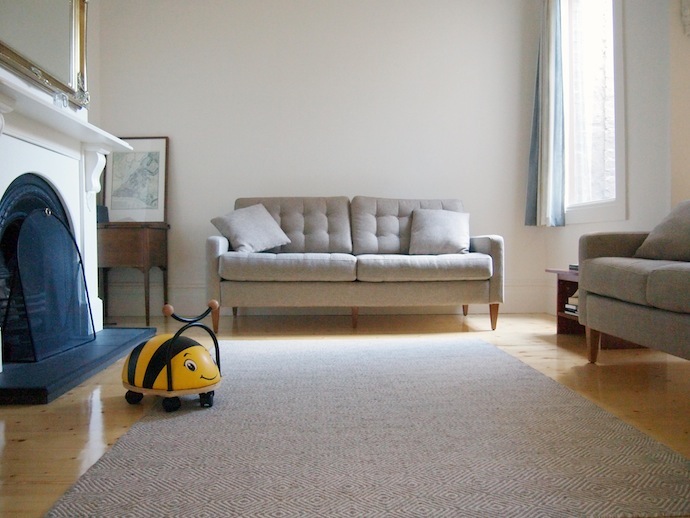
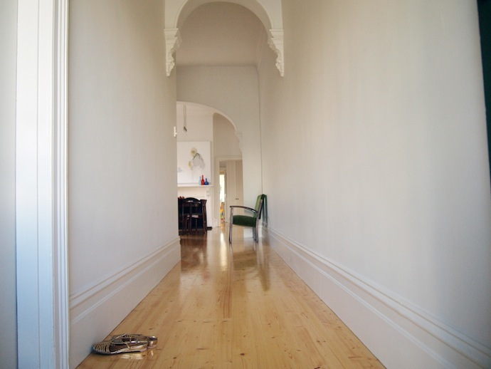
And this is what it looked like last Friday (somewhat uncharacteristically tidy because Madeleine was at daycare).
Look how gloomy and dismal these rooms were in the "before" photographs. Yet I had every (working) light in the house on when I took them. When we were choosing new lights for these rooms, we kept telling each other "The house is really dark, so we will need a lot of lights with decent wattage."
Turns out, a lick of white paint (or three or four - it took extra coats to cover that horrible green on the walls AND ceiling) and some fresh, light floorboards can completely brighten up a space. I took these "after" photographs with just the aid of natural light and I can't believe how much brighter the room looks (we used "Antique White USA" paint throughout, if you're interested).
Lesson 2: The illusion of space
We learned the same lesson when it came to space. This is not a big house, and when we started the renovation, we would tell our friends, "The rooms are very small, it's just a cottage." But we were amazed at just how much space there seemed to be in the same rooms, once the walls had been painted and the floorboards put in place.
For this reason, we have both curtailed our natural desire for big, bold, splashes of colour. There are not feature walls anywhere in our house, of either paint or wallpaper. The curtains are fairly neutral and unobtrusive. We kept everything simple and fresh to give the existing light and space room to play.
Lesson 3: Introducing personality
The plan, of course, was to bring the colour and character in with the accessories. Artwork on the walls. Cushions and throws and a feature arm-chair or two. Plants in pots and stands and hanging from ceilings. A really great rug. All that will have to come later, when the budget recovers from Phase 1.
Being forced to wait for all those things does have its advantages. Most importantly, living in the house before properly decorating it gives us time to see how things work for our family, specifically. I think we'll be making different decorating decisions now than we would have before we moved in.
Lesson 4: Toddler proofing
I'm a firm believer that you can still have a nice-looking home while keeping it safe for the little ones. We don't have any sharp or breakable items down low. In fact at the moment all we have are books, but I do want to add some other items, like globes and wooden ornaments, that look good but are still kid-safe. There's rubber around the hearth tiles to protect the children from sharp edges, safety glass in the windows, and child-proof plugs in all the power points. A consultant from Kidsafe came through the whole house to help us ensure it was safe.
We have a "no eating on the couch" rule, and no craft or messy games are allowed in here. It works without being too oppressive, because we have a play room for all that (more in a later post).
What's next?
ARTWORK: Clearly we need some art on those blank walls. But how many pieces? How big? We still haven't decided. We have some lovely canvases and prints resting on the floor in Emily's room right now, some of them quite large (like this one, which is 1.5 x 1.5 metres) but neither of us can decide where to put them or whether they will suit the space.
Apparently there are some rules to hanging artwork that help pull a room together subtly. Can anyone tell me about these? I've heard the paintings are supposed to be hung at eye level. But what part of the painting should be at eye level? And whose eyes are the measure of the level? (I'm short). Isn't there a rule about maintaining the same height in the middle of each work? Do you do that no matter what the size of the painting? What if (as in our case) there are paintings or mirrors above the fire-places, which force them to be quite high (certainly above my eye level): do we maintain that same height around the rooms, or go lower? It's all very confusing.
FURNITURE: We'd love to find a low, mid-century sideboard / radiogram (like this) to sit along the hallway in the lounge room, to open up that space a bit more. Even better if it was made of rosewood to match the dining table. We are keeping our eyes peeled locally (and saving our pennies).
We also want some other side tables, large pot plants, table lamps (I love these!), those sorts of things. But the ideas we had before living in the room don't seem quite right now that we're here. Decisions, decisions.
THE FLOOR: I think our floor rug needs to be twice the size of the one we have here, to give the room a greater sense of luxury and space. We both really love the colours and designs in this one.
SEATING: Those couches were new and while we like the look of them and are happy with the neutral tones (the plan being to brighten things up with cushions et al), they have actually turned out to be quite impractical. They are too tall, for one thing, so short little me struggles to breastfeed on them because my feet don't touch the floor properly! Also, those little buttons that give the cushions dimension easily come loose (one has already fallen off) and dig into you if you like to curl your feet under you as I do. Finally, they are so heavy that even with padding under the legs, they have already damaged our brand new and rather expensive floor. Never mind. First world problems, Naomi!
DINING: The dining table and chairs were a splurge. They are mid-century Brazilian Rosewood pieces, although we saved a bit by taking the chairs in original condition - one of these (much later) days we will have them renovated and reupholstered. The table extends out to seat more people, which is perfect for bigger gatherings without over crowding the fairly small room the rest of the time.
Question: what kinds of table coverings suit this kind of furniture? We love the table so we don't want to cover it completely with a table cloth, but we do need place mats and coasters to protect it. I think the cork place mats look kind of tacky - at least the ones I've seen - but the idea of adding to my laundry pile with cloth place mats is less than appealing. Any tips? Also, I really need to buy a beautiful, big fruit bowl (I love the look of these but am not sure about the size - mine needs to be HUGE). At the moment, that fruit is sitting in a Tupperware salad container.
LIGHT WELL: We love that the decking out here makes this space totally accessible. It's no longer damp or gloomy or dirty, so it's a lovely little contained place for the children to have supervised play while we're at the table. But because it is such an integral part of the dining room, we also need to decorate it nicely, to incorporate that space into the rest of the house. Mr B wants some kind of artwork out there (he likes mosaics but I'm not keen). I like the idea of a vertical garden but we're not sure if there will be enough light to maintain it. Mr B makes the good point that if the plants became sick or scrappy, it would look really awful. Another idea is to commission some kind of street-art style painting, or perhaps invest in some vintage outdoor signage. I'd love your ideas!
HALL: There's nothing there right now. I'm still thinking an Eames Hang It All coat rack would be nice, although I'm now leaning towards the neutral rather than multi-coloured version. That, and some kind of shoe-rack, an umbrella-stand, and other practical accoutrements. I'm yet to find the ones I like best.
Well, there you have it folks, our lounge/dining area in its "blank canvas" state. Despite the challenges, we really love this part of our new home. It's especially nice to have a "grown up" lounge area, since the kids have their play room out the back. I'll invite you into some of our other rooms in subsequent posts on this blog.
Little things - the weather house
 Little things in my home...
This dusty little German weather house sat in my Nanna's house, on a little shelf beside her kitchen table, for as long as I can remember.
As children it was the first thing my brother and I went for every time we came to visit her. It was the Nanna version of a Magic 8-Ball, so long as the only question we wanted answered was "Is it raining or is it dry, right now?" When the air was humid, the little man would come out of the house. I always wondered why he wanted to go out into the rain wearing such short shorts... On a dry day, the little lady would come out.
Despite having just come from outside ourselves, we'd race into the lounge room as soon as we'd kissed Nanna hello, to find out what the weather was doing.
My relationship with Nanna was... complicated. There was never hostility, but we were not close in the way that a lot of other people are to their grandparents. There was so much that frustrated me about my Nanna, and I don't think I was always kind to her, in my head.
But it wasn't fair. Because while I rolled my eyes at Nanna behind her back, her love for my brother and me was unwavering. In her eyes, we were golden sunlight. We could do no wrong.
Before Nanna died, she asked us if there was anything in her home that we wanted. I asked for this German weather house.
It sits in my office and, every time I look at it, I remember Nanna's kitchen table and those childhood days before I got all judgmental and superior, when Nanna was just Nanna: a funny-smelling old lady who still wore her hair in rollers to bed, told us Froot Loops were healthy (because they were made out of fruit), sang silly songs in a wavering voice, and had a room full of oil paintings in various stages of completion (oil paints and turps caused the "funny smell," I learned a lot later).
Nanna's house was a Federation bungalow with tiny windows. It was quite gloomy but, in my memory, that little barometer is always bathed in light.
Even when the man in his utterly impractical costume comes out to play in the rain.
:: :: ::
“Little Things” is an occasional series about the stories behind some of the little things you’ll find around my home. Are there stories behind the little things in your home? I’d love you to tell me about them! Or if you’d like to join in and write a post like this of your own, don’t forget to share a link to it so I can read it.
Little things - hand blown bottles
The Global Financial Crisis hit New York about six weeks after I moved to SoHo in 2008. It was just in time to come AFTER I'd signed a 12-month lease on my apartment, effectively locking me into a year in a dodgy, six-floor walk-up with mice and bed-bugs, for a price that could have rented me a doorman building and an internal laundry, if only I'd waited. The crisis also hit the Australian dollar hard, which was particularly tough since I was in the US on a Foreign Correspondent visa so all my income was Australian. Suddenly, I lost 40 percent of everything I earned in the exchange, and that came after tax. The meagre savings I took with me on the move that should have paid for new furniture and everyday household goods that you take for granted (like dinnerware and cutlery and pillows and clocks), was almost completely swallowed up by currency exchange. There was just enough left to cover my broker's fee.
So, like so many people before me, I started my new life in New York by furnishing my apartment with an odd assortment of hand-me-downs, thrifted finds and found objects. A dubious futon sofa-bed, left behind by the previous tenant. A desk that a client of my friend's cleaner was giving away. An unbelievably-heavy metal shelving unit, left on the third-floor landing of my building.
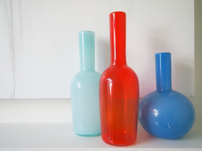
These three bottles were among the very few luxuries on which I splashed out during that time. They are hand-blown, and graced the window of a homewares store on Thompson Street a block or so up from where I lived. I thought they were just beautiful. The play of the three colours. The way the light flowed through some surfaces and bounced off others. How smooth and heavy they felt in my hands. I carried the bottles home and sat them the window sill overlooking my fire-escape where the sun, even during darkest winter, could do them justice.
There wasn't much I took home with me when I returned to Australia, but these bottles were among the first I packed. Carefully, tenderly, in reams of tissue paper and bubble wrap. And despite five Interstate moves in the 18 months that followed, this little glass trio has graced a table-top, a window-sill or a mantle-piece in every house I've lived since.
Our newly renovated home is still very much a blank canvas. You won't see many pictures on walls or cushions on couches or other little pieces to give it character. That's why I haven't featured before-and-after photographs or stories on this blog yet (that, and because by the time I've cleaned and tidied the house to a degree to which I'd be happy to photograph it for you, there's no time left to actually take the photographs). But my three New York bottles sit proudly above the hearth in our dining room, still gleaming like jewels after all that time and all those moves.
Until I came to Melbourne, I really hadn't felt at home since leaving New York. In each place we lived, these three bottles were my pretty little homesick tonic. Something both constant and lovely.
:: :: ::
"Little Things" is a new, occasional series about the stories behind some of the little things you'll find around my home. One day, I promise to share the big stories about our home renovation. Are there stories behind the little things in your home? I'd love you to tell me about them! Or if you'd like to join in and write a post like this of your own, don't forget to share a link to it so I can read it.
ps. Can you help? I'd love to know more about the artist who made these bottles. I bought them from a shop called Clio on Thompson Street in SoHo (between Prince and Spring) which has since closed down. The owner told me the artist was from Brooklyn, but that's all I know.
Are you still there?
 Oh hello Internet, how have you been? I've missed you! I am obscenely pregnant. My belly is like a beach ball out in front of me, an alien beach ball that warps and wiggles and thumps and seems to manage to be everywhere at once, on the inside. Only five short weeks and Baby B2 will be out in the world with us. That is insane! I will love this baby with all my heart but I am SO not ready to manage the extra responsibility.
In the past few weeks since we were last in touch I tried out (temporary) single parenthood. I don't recommend it. My hat is well and truly off to those who do it all the time. You guys are my HEROES.
While working, and battling a horrible virus (I coughed so hard I cracked a rib), and caring for my child 24-7 (and I really mean the 24 bit, Madeleine took to sleeping not only in my bed but on my pillow and ON MY HEAD), I also trialled life without a couch to sit on, without books, and without a television. At meal times we watched a lot of Peppa Pig on iView in order to keep Madeleine still (because we were also living life without tables to sit at). By night I watched a lot of previously-downloaded-on-iTunes Dr Who while packing boxes (because I happened across an old episode while flicking randomly through channels a couple of weeks earlier, and just had to find out what the deal was with that woman called River, and Amy "the girl who waited." Most intriguing).
And then while still single-parenting, Madeleine and I moved house. That was fun.
Actually it wasn't too bad, due mostly to my gorgeous friend Tonia, who took the day off work and filled her car with drop-offs for charity shops, ferried the dog to and from his hair salon (new houses require clean dogs), fetched lunches and dinners and emergency groceries, unpacked and tidied up a storm, made the beds, AND made Madeleine (and me) laugh. What a trooper! What a friend!
Oh but then we entered life without Internet as well as TV, the couch arrived but it was wrapped in plastic and needed the feet put on and I was too pregnant to be able to lift it (and therefore we couldn't sit on it), the books were still in boxes, and the cat wouldn't come out of the back shed. AND no hot water for almost a week. AND no curtains on the bedroom windows (helloooo neighbours, helloooo lack of sleep).
Still, Madeleine didn't care. She and I were well and truly used to sitting on the floor by then, and we could make our own fun. We'd boil the kettle and bathe her in my fabulous new ceramic farmhouse kitchen sink. I had a lot of wash-downs. Plus, Madeleine had a whole new house to run up and down in like a crazy person, and stairs to be constantly told not to climb (no safety gates yet).
So we chipped away at the unpacking and the setting up and on Saturday afternoon (a whole 24 hours early) Mr B came home. And darn it if I wasn't just a bit more than a LOT glad to see his jet-lagged face. (If you want to know what he was doing overseas, read this blog).
Earlier this week the hot water came on. Yesterday we finally got the Internet working. I have a tiny office of my very own, in a converted wine cellar. Madeleine has a play room. We have a grown-up living room AND a dining room (with a dining table at which we actually sit to eat. If you'd seen our previous several homes you'd know what a posh luxury this is for us.) There's still a lot to do (curtains on the bedroom windows pleeeease), but room by room our new house is starting to feel like a home. I can't wait to share some befores and afters with you of this renovation experience.
(Photo is of the three of us about a week before Mr B went away. Madeleine wore that strawberry costume all day, a gift from this Deb, stroking the shiny sleeves like you stroke a sleeping kitten).
Renovation inspiration - living and dining
Small spaces are tricky to furnish and decorate, aren't they. For example a combined lounge and dining area that isn't entirely teeny-tiny but certainly isn't spacious, like the one in our new house... how would you fill it and make it yours in a way that worked? For us, the big challenge is designing the rooms so they look great and function practically, but don't feel overcrowded. Here are some ideas I've gleaned from the Internet so far.
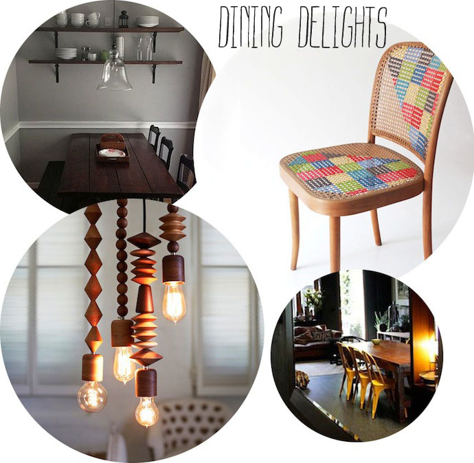 ↑↑ The dining area has to visually fit in with the lounge area, so the decor needs to work on a broader scale than just "eat here." I love the pop of these yellow chairs, or this amazing cross-stitch chair (which unfortunately is a DIY, so let's face it I'm stumped). I also thought putting open shelves above the dining table was a lovely idea that was both decorative and space-saving. Meanwhile, those pendant lights? I LOVE them and think they would be perfect above our dining table. Mr B disagrees. Cue sadface.
Clockwise from top left: open shelves in the dining via Design Sponge; cross-stitch chair via My Poppet; yellow dining chairs via Living Room TV; pendant lights via Marz Designs
 ↑↑ In a small space, furniture that shares wall-space or serves multiple functions is great, because you get maximum use and appeal while taking up minimal space. My favourite? This stylish fold-out wall-desk. I think it would be fantastic in our hall, to dump keys and mail and Mr B's ties on as we walk in, before folding the mess up and away.
Clockwise from top-left: wall-desk via Swiss Miss; low bench and mini-gallery via Old Brand New; mid-century-modern style pet boxes (so stylish they can double as coffee tables!) via Modernist Cat on Etsy; wall-leaning side-tables via Kenyon Yeh
 ↑↑ We've decided to splash out on new lounge chairs to go with our new house. Our existing lounge chairs were around before Em started school (she's 15 now). They have taken a LOT of family-related love and rough and tumble and wear and tear. They're threadbare on the arms, and seem to have magical talents when it comes to collecting dirt and food and cat hair and goodness knows what else. It. Is. Time.
Clockwise from top-left: leather armchair via Design Sponge; granny-square covered mid-century couch (I love this so much!) via Zakka (originally seen on Meet Me at Mikes); the after in a 'before & after' upholstery project on a small sofa via Design Sponge; super comfy-looking antique-style sofa via Home Life
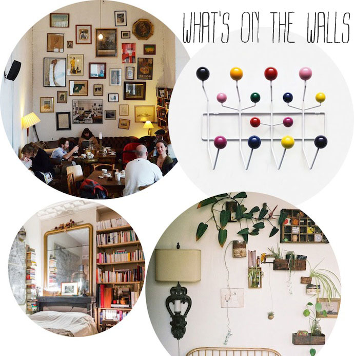 ↑↑ For these small rooms, Mr B and I have somewhat reluctantly reined in our love of colour and opted for fairly neutral bones: white walls, pale floorboards (the original colour), simple sheer curtains. So we're relying on all the finishing touches to add character and interest to the rooms. Walls are a great canvas to start doing that, and I've been searching around for creative ideas.
Clockwise from top-left: gallery wall via Poppytalk (I've been thinking of these a lot lately but I'm nervous about doing it right, I'd love your tips); a classic 1950s Eames Hang It All coat rack; eclectic mix of ornaments, recycled objects and plants on the wall via Old Brand New; gilt mirror (for above the fireplace) via English Muse
What are your top tips for decorating in a confined space? What do you dream about having in your lounge room, or dining room, or both?
Want more renovation inspiration? These are my kitchen ideas.
Renovation inspiration - the kitchen
What's in your dream kitchen? Mine* will have floorboards and white cupboards and wooden benchtops and a big, fireclay farmhouse sink. It will have a gas stove and a big oven that doesn't leak, is easy to clean, and is up high so curious little hands can't get into trouble. My new kitchen will have LOADS of storage and, even though I love the look of open shelves, everything will be closed off inside cupboards because there's nothing worse than that sticky grime-dust that gathers in cooking places over time. But all those cupboard doors will steal a lot of personality from my dream kitchen. How can I inject the character back in? Here are five ways I've been admiring from around the Internet of late.
 ↑↑ I think these utilitarian light fittings would be perfect for a kitchen that's a bit rustic, like mine. There are some amazing vintage and handmade light shades in this style that Mr B and I have been admiring, but those can cost thousands of dollars, and you can get something pretty similar from Ikea for $29.99. So...
Clockwise from top left: white vintage shades via Manhattan Nest; black rustic shade via Design Sponge; modern (vintage-look) red shade via Design Sponge; handmade 'tram light' via Life Space Journey
 ↑↑ Plants add a sense of warmth to the kitchen (as well as adding oxygen), and bring a little of the garden inside, especially if you have the light to grow edible herbs inside. My new kitchen will only have a small window, so I'm not sure how well herbs will grow in it. Alternatively, I'm also rather smitten with these dried herb posies, in the cupboard or hanging from a piece of driftwood on the ceiling.
Clockwise from top left: driftwood herb and pot rack via Poppytalk; dried herb cupboard via Bright Bazaar; garden shelves in the window via Design Sponge; plants on the wall via Old Brand New
 ↑↑ Because I've opted for all white cupboards and no open shelves, I was thinking a bit of wall decor might be the way to brighten up my kitchen and give it some colour and personality. I thought these were pretty cute ideas, from chalk-board 'windows' to removable wallpaper (and how cool is that brown paper shopping-list scroll?).
Clockwise from top left: renters' wallpaper via Oh Joy; chalkboard wall and 'window' via Poppytalk; neon pink cuckoo-clock via Design Sponge; shopping-list scroll via Ebb & Flow
 ↑↑ How fun is the pastel-and-neon phase that's going on these days? I'm also loving all the geometric shapes and patterns. And when you combine them with handmade techniques and natural elements... winning!
Clockwise from top left: many-coloured ceramic canisters via bfiess; neon-painted wooden bowls via Nicole Porter Design; colourful, geometric coasters via brika; geometric mugs via Barbara Bestor
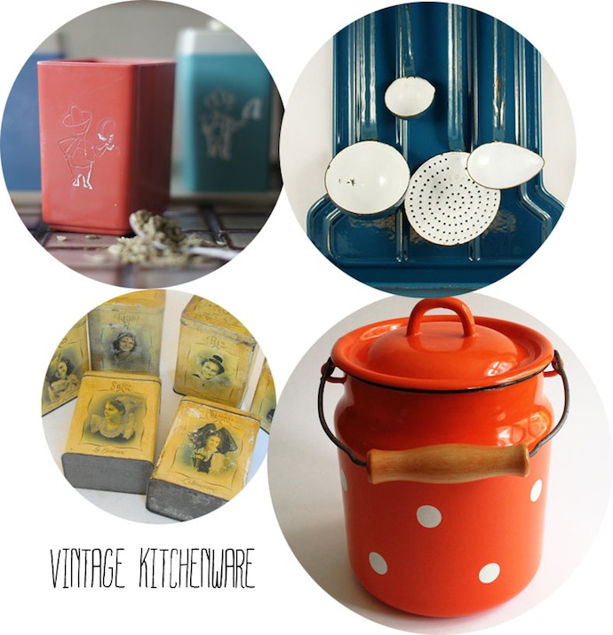 ↑↑ For the past I don't know how many years, I have been on the lookout for the perfect vintage kitchen canisters. They have to be enamel, but have good working seals still in place, no rust, and great colour. One day I will find them and they will sit happily on my kitchen bench. Meanwhile, here are some other great-looking (and brightly coloured) vintage finds I've been loving on Etsy of late.
Clockwise from top left: retro cowboy spice canisters via Tangerine Toes; vintage Dutch kitchen rack via Smeerling Antiques; polka-dot Soviet enamel milk can via Riga Vintage (more of my Soviet-era polka-dot finds here); vintage French tin canisters via Vintage French Linens
OK your turn. What would you have in your dream kitchen? What would make you happiest?
* If you're new to this blog, we are renovating our house. This is what it looks like from the outside. This is what it looked like inside, a couple of weeks ago.
Renovation inspiration
 "Renovation inspiration" is going to be a new occasional feature on this blog. It will be a place where we can all dream about creating ideal spaces in our homes.
I need this feature to help keep me positive about the renovation that is underway on our new (old) house. This is what it looks like inside today.

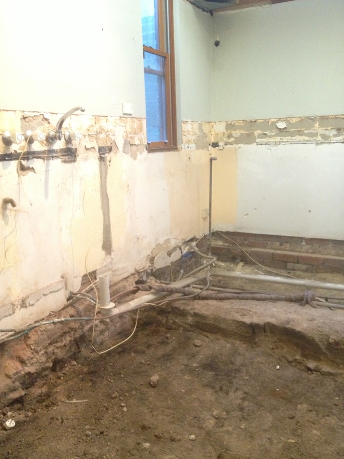 We are two weeks in and already countless skips of rubbish and rubble have been removed from the street out the front. At first that was incredibly positive. It felt like progress and I could imagine my family living happily ever after in our little cottage.
Then the inevitable happened. Scope-creep.
Like, the floor boards and the joists supporting them turned out to be in such bad condition they had to be pulled up and replaced. Shazam! A hefty five-figure increase to the already-stretched budget, and another several weeks added to the whole process.
Then the little things started coming up in conversation. Little things like this.
Building manager: A lot of the old locks need to be replaced.
Us: OK, let's get a locksmith in to replace all the locks so the house is secure.
Building manager: No problem. That will be another several thousand dollars.
Ditto the conversation we had about modernising all the electrical outlets and light switches. Oh and the "we hadn't expected that" unusual plumbing in the upstairs loo ("unusual" is a euphemism for "expensive" in renovations, I'm learning). And a whole bunch of other 'little' jobs that are sending this project through the financial and time-line roof.
I know these are important to the finished product and, while we were thinking big (kitchens, bathrooms, floorboards), we should also have been considering light switches and locks. Being newbies to renovating, we didn't get our heads into the nitty gritty until the process was underway. But I can't help thinking that our building company on the other hand is not new to the process and possibly would have anticipated that these sorts of issues generally come up. Yet they said nothing. And so I can't help feeling a little bit... managed.
Be that as it may. Part of me knew that scope-creep would happen, in one form or another. It happens in every renovation story I have ever heard. It happened to my parents when our family owner-built our home while I was a teenager. That doesn't stop it being stressful right now, but it does help me hold onto perspective.
And the good part is still dreaming about the home we are going to create, albeit at a greater financial, emotional and time cost than originally budgeted. So I'm going to start this feature called "renovation inspiration" and we can all dream together.
Very few of us have the cash or time or opportunities to make everything just the way we want it. But let's think together about the little things we can do to our homes to help us feel that little bit happier to be in them. It could be something as simple as cleaning up, or bringing in a fresh vase of flowers. Or hanging a new picture on the wall.
I'll start next week, and I'll start with kitchens. What is in your dream kitchen? Let's get thinking and inspire one another.
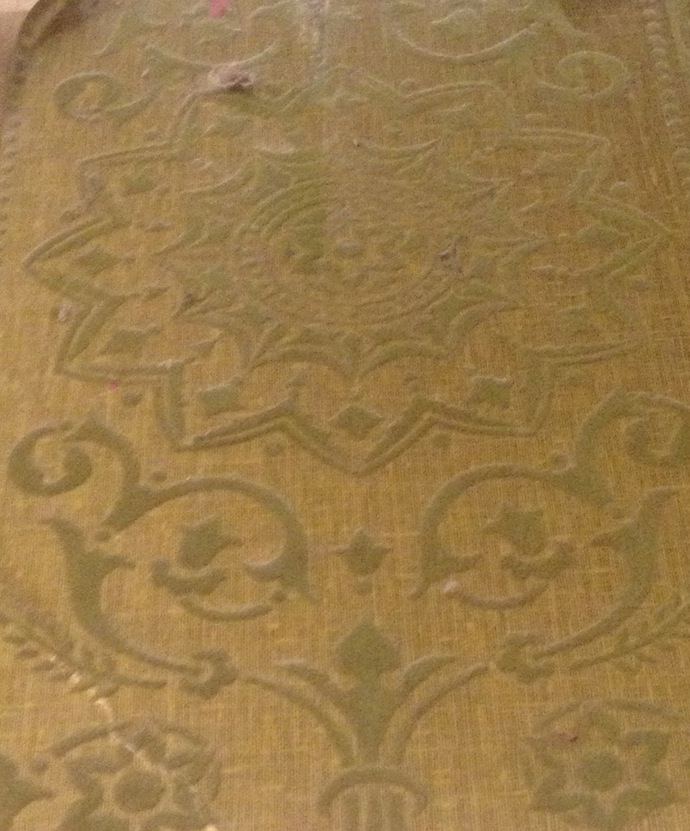
ps. Take a look at this amazing gold-and-green Victorian velvet wallpaper uncovered in our front room. I think it is all kinds of spectacularly, hideously wonderful.
Going home
 Guess what? We are going home!
We are moving into our own home, I mean, not a rental. I am incredibly excited. I can't even begin to tell you how insane the nesting hormones are going inside me right now. Squirrels on caffeine, just picture that. Then triple the energy output.
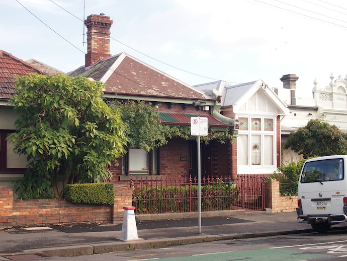
 This is our home (top pic is of the front, bottom pic is of the back). It is a little cottage, one street away from where we are living now. It has to be renovated before we can move in, so Madeleine and I snuck in earlier this week to take some 'before' photos ahead of the demolition process. (That was on Tuesday. On Thursday I walked past and there was a great big skip out the front already half full. It made my heart sing).
The budget doesn't stretch to extensions or any big structural changes, but we will have new bathrooms and a new kitchen (oh boy!); fresh paint and floorboards (right now, there is a downstairs colour scheme of dirty green carpet with dirty green walls, upstairs is a psychotic sensory assault of pink carpet with pink walls and pink CEILING, and everywhere you don't see green or pink you see yellow-ish 70s wood paneling, on both walls and ceilings); plus some extra bits and pieces and cabinetry like a conversion of a wine cellar into a teeny-tiny office for me. Later, we will pull up some of those tiles outside and plant a garden. And build a pergola to cover with vines for outdoor dining.
There are also some beautiful features to the house that we plan to keep. Like lovely Victorian details and fireplaces. Pressed metal patterns on the ceilings in the living room, dining room and kitchen. A light-well that we will paint up and fill with vertical gardens and decking as an extension of the rest of the room. And views from the master bedroom across all the old rooftops in our area, probably much the same as anyone who wanted to look would have seen 100 years ago.
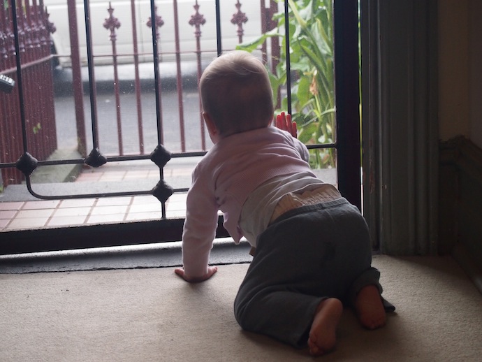
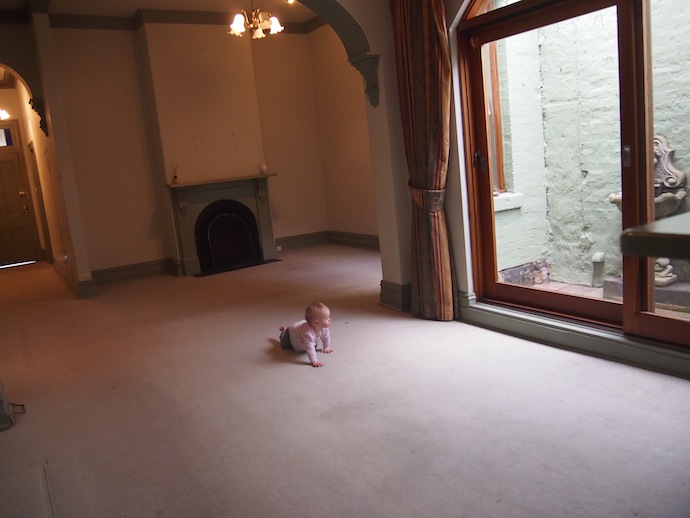
 I spent all day yesterday looking at tiles and taps and shower-heads, and I enjoyed it. Today I have to see a woman about a doorknob. I can't wait to share our new home with you as it starts to take shape!

