JOURNAL
documenting
&
discovering joyful things
Thousand Postcard Project - still charming
What can I say? These old postcards continue to charm me.
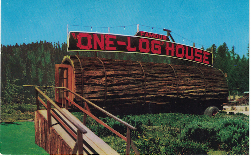
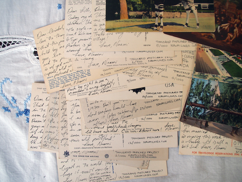
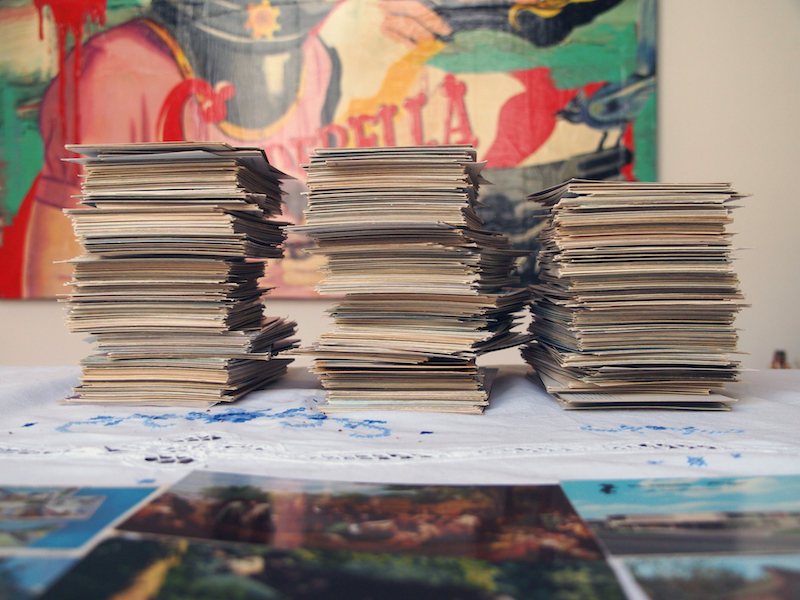
I've written more than 300 postcards so far this year, with another 700 to go before Christmas, and I am loving this project so much. Every new postcard is like a lucky-dip. Stunning vistas! Turnpikes! Cringe-worthy cultural stereotypes! A boring motel! An even more boring bridge! The marketing geniuses of the 20th century were nothing if not optimistic about what would inspire the passing tourist. (Although the one-log house in this set actually looks pretty cool. I wonder if it is still there. Does anybody know?)
And the joy of reaching out to friends and strangers alike with my words. Thoughtful words, poetic words, foolish words, lighthearted words. Just words, connecting us all over the world.
I've had to close off the form to request a postcard, because I already have a thousand people waiting for me to write to them. If you missed out, never fear! There will be plenty more mail projects still to come. Watch this space (this blog)...
Thousand Postcard Project - recent favourites
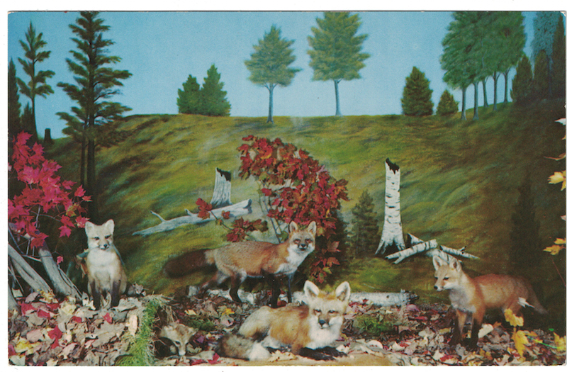 This postcard. How weird and spooky and great is it? Fox collage is where it's at, friends. (And what does that fox have in its mouth? Is that... a flower?)
Oh hey, I'm still writing postcards! If you're waiting for yours, I promise it will come eventually. Remember this is supposed to be a year-long project, so depending on how many addresses are ahead of yours on the list, it might take me a little while to get to you. But I won't forget you!
Here are some of my favourites from the most recent batch of postcards I sent out.
1. A gentle stroll through a chapter from 'Anne of Green Gables'...
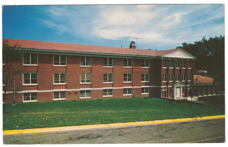
2. A super-boring building (boring building postcards never get old) (except this one, which is actually more than 50 years old)...
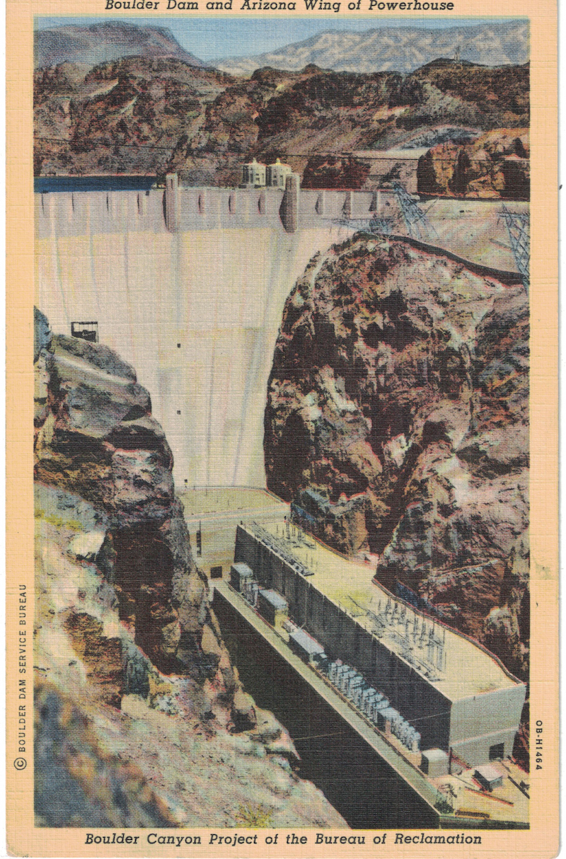
3. A picture of a dam that gives me the heebie-jeebies because it looks so fragile, set against nature like that. (For people in the US who might know this dam, it's now called the Hoover Dam)...
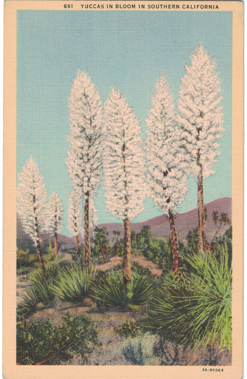
4. More scenes from the wild, wild west...
Thousand Postcard Project: welcome to the wild, wild west
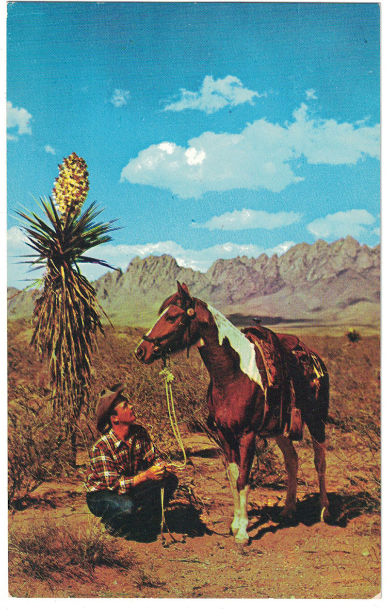
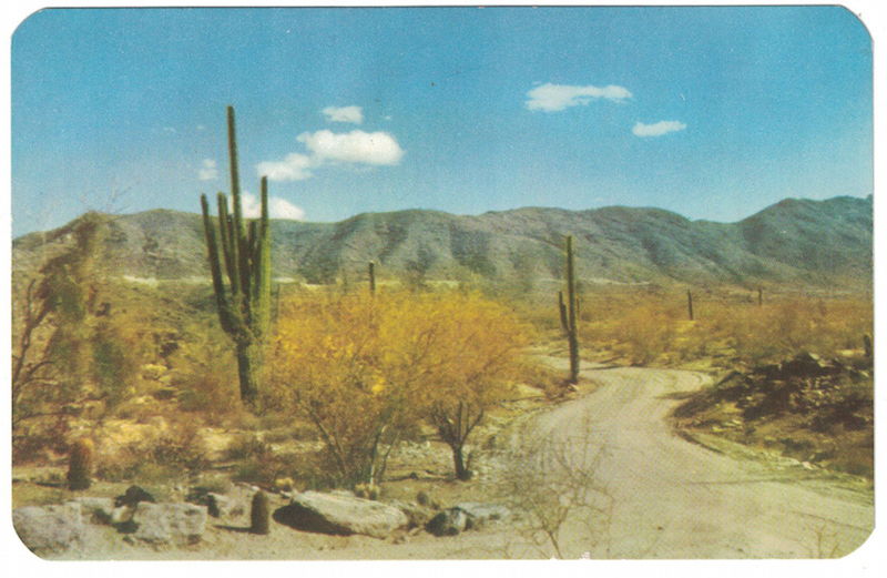
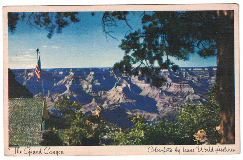
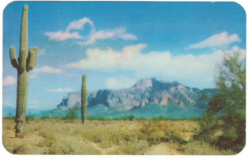
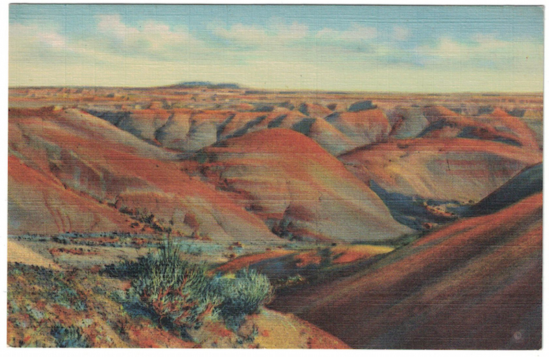
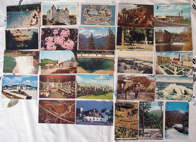
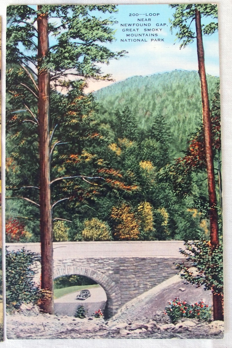
These are some of the postcards from my ongoing Thousand Postcard Project for 2017. Aren't they wonderful? I am still a fan of all those blurry hotels and quarries, but these are true linen beauties!
If you'd like a postcard, you can still ask for one here.
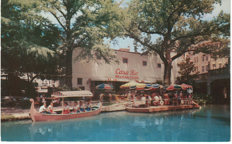
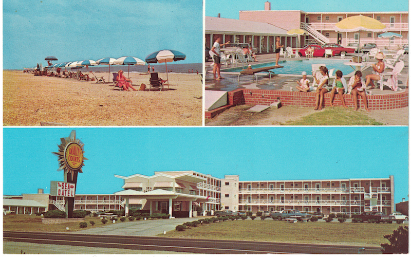
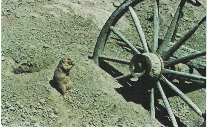
Thousand Postcard Project: 116-158/1000
 Here are some of my recent favourites from the ongoing Thousand Postcard Project.
ΔΔ The postcard above just really appealed to me. At the time, I couldn't tell if it was the colours or composition but, later, I realised it was because it reminded me of the badly-drawn book covers on the old Mary Stewart novels I used to read. Mary Stewart was my guilty-pleasure airport-but-not-only-airport author: she wrote romance-thriller novels, often set in 'exotic' locations, with obscure literary references. I devoured them! A lot of the books were written in the 50s, 60s and 70s, so the cover-art involved this kind of upright, amply-bosomed heroine, generally among rocks or ruins or cliffs.
Here are some of my recent favourites from the ongoing Thousand Postcard Project.
ΔΔ The postcard above just really appealed to me. At the time, I couldn't tell if it was the colours or composition but, later, I realised it was because it reminded me of the badly-drawn book covers on the old Mary Stewart novels I used to read. Mary Stewart was my guilty-pleasure airport-but-not-only-airport author: she wrote romance-thriller novels, often set in 'exotic' locations, with obscure literary references. I devoured them! A lot of the books were written in the 50s, 60s and 70s, so the cover-art involved this kind of upright, amply-bosomed heroine, generally among rocks or ruins or cliffs.
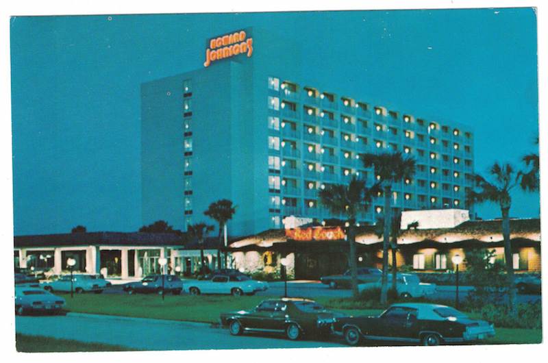
ΔΔ I think this postcard is one of the best of the lot, because it is so gloriously BAD. Here is what I imagine happened:
The marketing minds behind the Howard Johnson's hotel decided that a postcard was needed in order to draw in more guests. They sent one of their junior staffers out with the company camera and a roll of film, and told him to capture the 'beauty' of the building at night, with the neon sign proudly lit. But the junior staffer forgot to bring the tripod, and when they had the film developed, every photo was blurry. Rather than do it all over again, they just picked the least blurry of the lot and went with it.
I wrote something along these lines on the back of the postcard before I sent it and, last week, I received a reply in the form of another postcard, depicting... traffic. On the back was written, "I see your blurry hotel photo and I raise you Birmingham's round-about." I will TREASURE that postcard. I'm still giggling. Blurry hotels and round-abouts are why I love this Thousand Postcard Project so much.
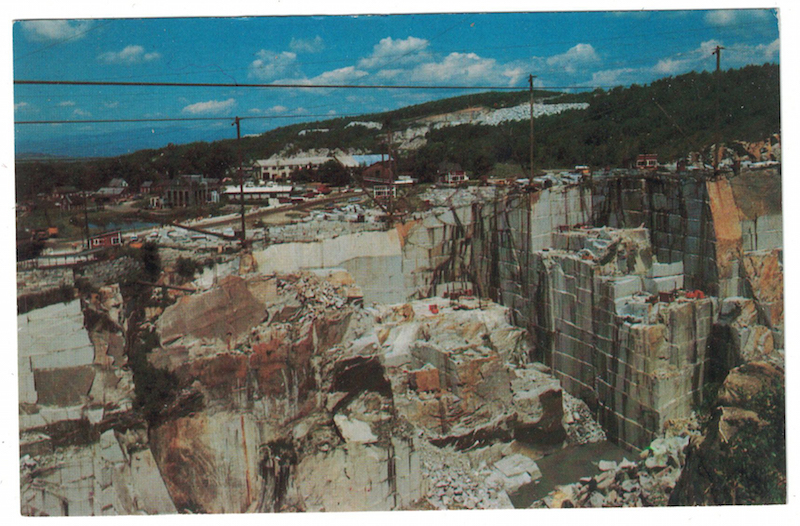
ΔΔ Here is another fabulously ugly postcard. An open quarry. WHYYYYY? Who came up with the idea that THIS was what would draw visitors to their town?
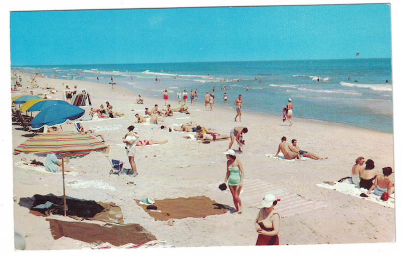
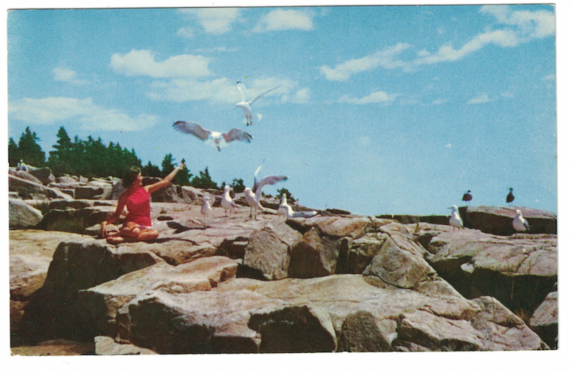
ΔΔ This beach photo made my 'favourites' list because it doesn't even bother with a location. The caption on the back just says something along the lines of "enjoying the sand and clear water" (I can't remember the exact words). I like to imagine that this beach photo was used to promote at least six or seven locations. You could just pick a State famous for beaches (like Florida or California) and shove these postcards in every tourist stand up and down the coast, for people to send to their friends.
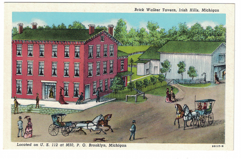
ΔΔ Badly drawn illustrations are always my favourite. This one in particular because the man in the blue suit and hat at the bottom of the picture is carrying papers. What is written on them??
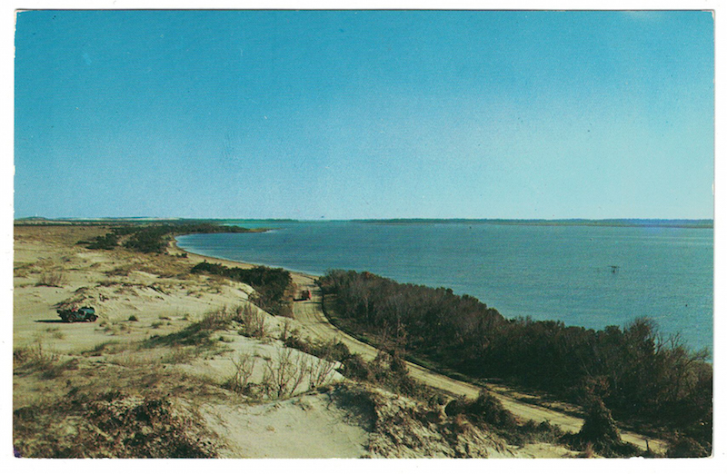
ΔΔ According to the information on the back of this postcard, this was the coastline where the pirate Blackbeard hid treasure. It's not the Cornish coastline I imagine when I think of pirates and smugglers and caves, but maybe I just read too many Famous Five books when I was little. Do you think there could still be treasure buried in all that sand?
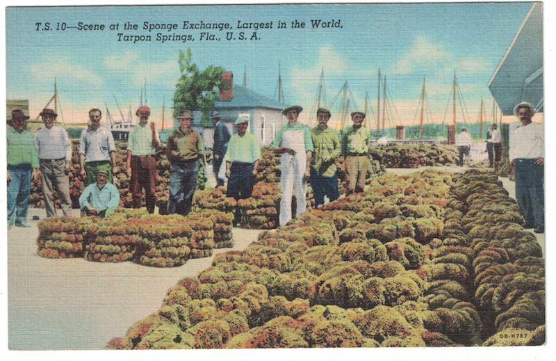
ΔΔ The biggest sponge exchange in the world. Who knew there were sponge exchanges!? I guess I should have known, sponges weren't always the synthetic bouncy things we use in our kitchens today, but still, wow!!
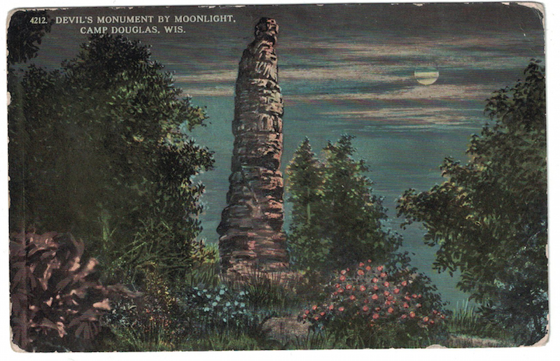
ΔΔ Remember what I was saying about badly drawn picture? I think this postcard is GREAT because they have taken a weird rock formation and decided it would look more spooky by moonlight, and still managed to do a terrible job. Framed smack in the middle of the picture, with the best fake ghost-story-moon ever, and some pretty flowers all around for a softening effect. If you are going to draw rather than photograph a famous thing, surely you'd take the opportunity to give it a slightly more artistic composition?
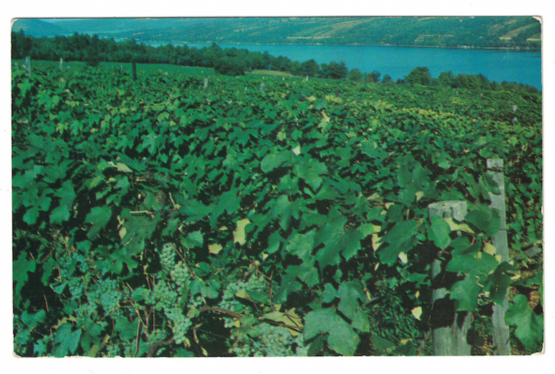
ΔΔ These vineyards were in upstate New York (from memory) and the person I was sending the postcard to just so happened to live in the same State, so I set her the challenge of finding this exact spot and taking a photograph of whatever is there now.
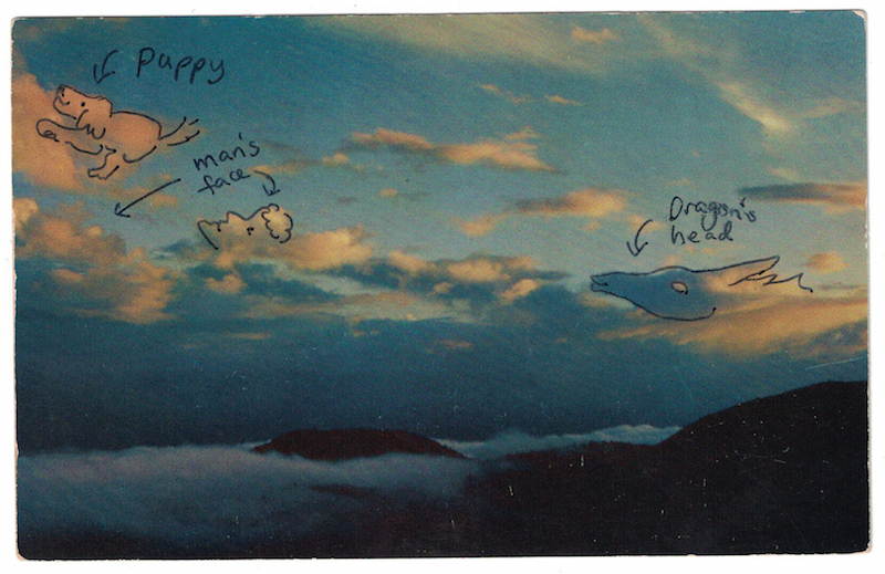
ΔΔ Another brilliantly boring photograph. Clouds! Dear traveller, unless your friend lives in the desert and it has never rained ever in their whole life, odds are they have clouds at their place, too. Send them a picture of a quarry or a blurry hotel instead! I thought this postcard was so boring, I decided to find pictures in the clouds to liven them up for the recipient.
Well folks, that's the end of this update. I'm still writing postcards so don't think I've forgotten you if you're still waiting. A thousand postcards is a LOT of postcards to write! And if you're reading this and you're thinking "A crappy vintage postcard is what I really need in my life right now," I'd LOVE to send one to you, too. Go to this page to give me your address, and keep an eye on your letterbox.
Pie fail
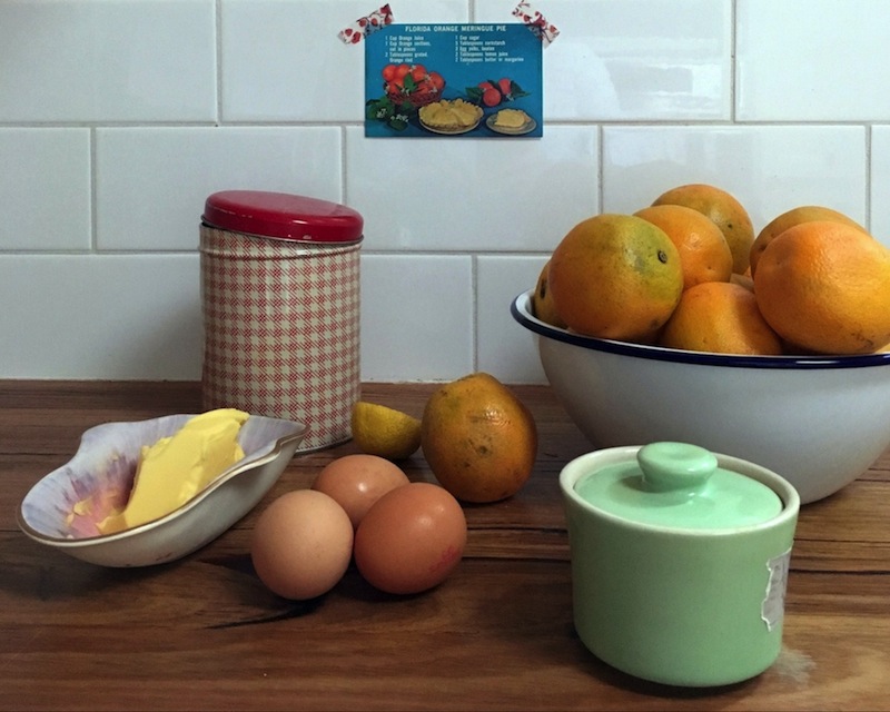
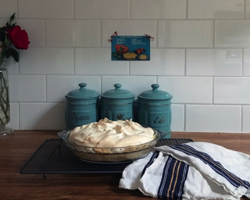
This is an appeal to the people of Florida, to rescue their famous dish from the slander that is about to follow...
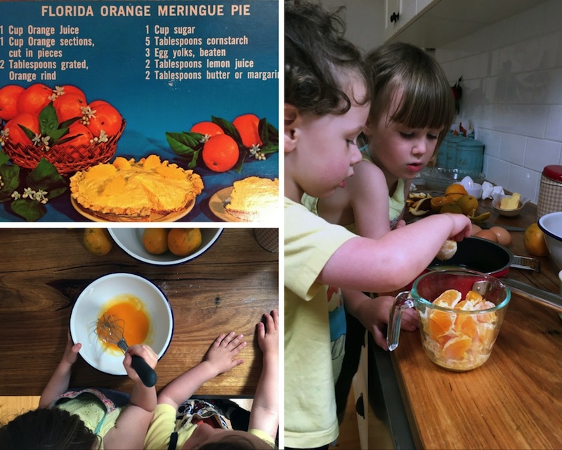
While writing my way through a giant stack of vintage postcards for the thousand postcard project, I came across this wonderfully lurid recipe-card from the 1960s or 70s. The children and I decided we had to give it a try before sending it on (it ultimately went to my cousin in the UK - it was 68 of 1000).
After all, I figured, "Orange meringue pie. I like oranges, I like lemon meringue pie, this is going to be delicious!")
Spoiler alert: it wasn't.
Maybe it's my fault. I'm not much of a baker. Or maybe it's the postcard's fault. The instructions were pretty vague and, never having tasted this pie before, I didn't really know what flavours I was supposed to be going for.
Whoever or whatever is to blame, this pie tasted like orange-flavoured cough-syrup. Only gelatinous. And nuclear reactive in colour.
So, dear People Of Florida, how is this pie supposed to taste? What did I do wrong? And do you have a better recipe for me to try?
:: :: :: ::
ps. For anyone not from Florida who is brave enough to try this (WHYYYYY???), the ingredients are on the front of the postcard that you see pictured here. The method, printed on the back, was as follows:
Combine orange juice, sections, grated rind, sugar and cornstarch. Cook on low heat until clear. Add a little hot mixture to beaten egg yolks. Return to hot mixture and cook about 5 minutes longer. Remove from heat. Blend in lemon juice, butter or margarine. Pour into baked pie shell. Be sure filling and shell are both hot or both cold. Cover filling with meringue. Bake in 350° oven until lightly browned.
There were no instructions for the pastry or meringue, so you'll just have to wing those bits. Tell me how you go!
Thousand postcards > 86/1000
 The other day as I sat at my desk writing on old postcards (they smelled like old books), Scout sidled up to me. "Postcards, postcards, you are forever writing postcards," she said. Then she and Ralph began rifling through the box, pulling them out one at a time to look at all the pictures. I told them they could choose one each and I'd send them in the post just like all the others, so Scout chose an awful-looking yellow flower that looked like a weed, and Ralph chose a photograph of a replica of the Mayflower. The postcards are all numbered, so they will have 75/1000 and 76/1000 in their possession, once this entire collection goes out. In total I've sent out 86 postcards so far. This is fun!
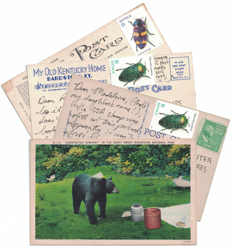
Here are some from the most recent collection that I've really been enjoying. The postcards above... I loved that 'bear visiting the picnic' picture, because, what even!? "Hey, tourists, come visit us and wild killer animals will invade your lunch!" Also I wanted to draw your attention to the reverse sides of the postcards with it - I just love the art deco lettering in the one on the top... and the one-cent stamp costs (if only!), including one with the one-cent stamp still on it.
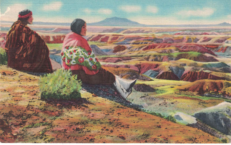
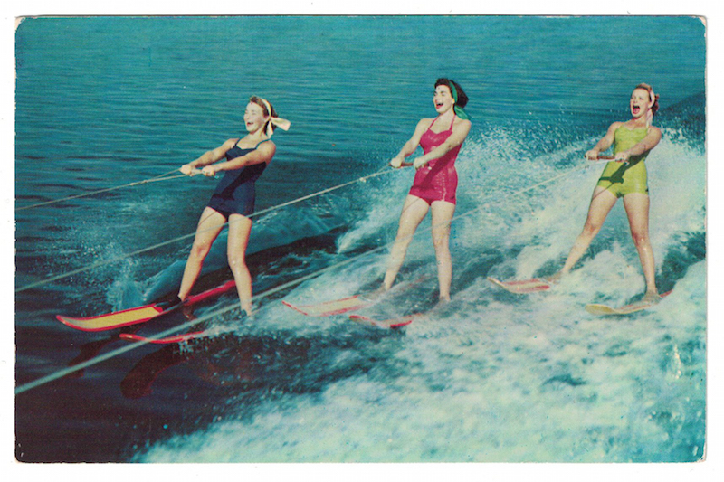 ΔΔ These ladies! This postcard makes me so happy
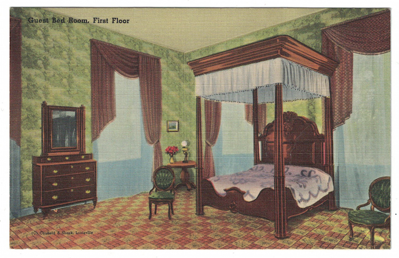
ΔΔ It's just funny. A bad drawing of a lonely room that once belonged to someone famous. And funny perspective, like those photographs real-estate agents take to try and make rooms look bigger than they are: why is the chair on the left so small compared to the other one? Is the room 100 metres wide?
ΔΔ Every time I look at this I hear music from Elvis movies in my head
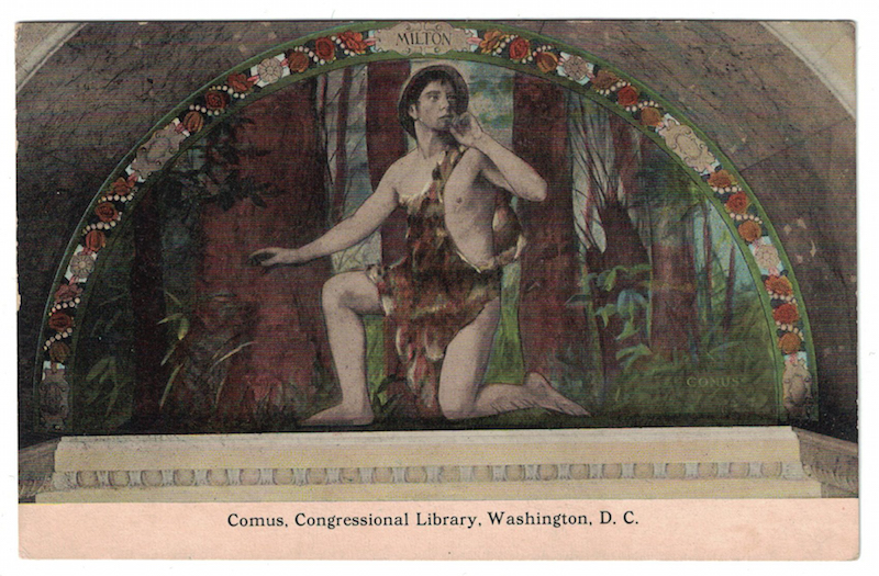
ΔΔ Ok now while technically I can blame a respected artist (John Milton) rather than a middle-management postcard maker for the hilarity in this image, seriously, what? The pasty-white guy in Tarzan-style animal skins and a safari hat/ladies' bonnet, doing the Dolly magazine shhh-pose, is supposed to be Comus, the Greek god of revelry, known for his debauchery. You see the humour in this too, right?
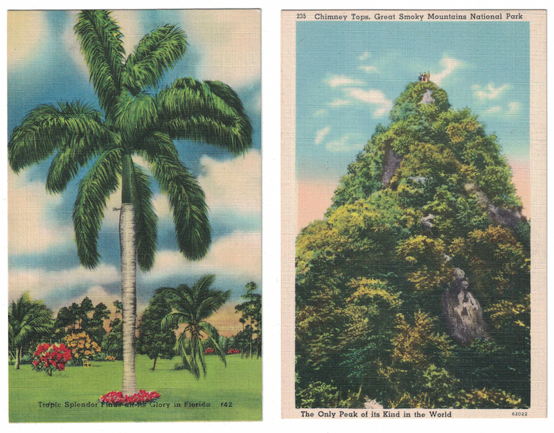
ΔΔ Oh the glorious and over-the-top colour in these linen postcards! Recently I read an article about these postcards, which were apparently printed by the millions in America during the depression and war eras. They were created as a kind of panacea to the everyday challenges people were facing, in the same way that the movies of the time were so often full of joy and dancing and lighthearted fun.
It said, "The America depicted on linen postcards was just about always surreal in color and exaggerated in perspective. It didn’t matter if the subject was a natural wonder, a cityscape at night, the exterior of a hotel, the interior of a restaurant, or a hulking industrial facility. Linen postcards made everything look larger than life."
I have been loving finding them in my box of vintage postcards. The texture is so lovely in the hand, and the colours are truly other-worldly, and so much fun. I totally get it!
ps. Don't know what this is all about? I'm sending a thousand vintage postcards in one year. If you'd like one and you haven't already signed up, you can ask for one here.
Thousand Postcard Project: 1-25/1000
Last week a box of a thousand vintage postcards arrived for me in the mail. They are all between 40 and 110 years old, and most of them Americana - old postcards advertising hotels and stores, landmarks and movies.
I decided they'd spent enough time tucked away gathering dust in boxes and drawers, and that it was time to give them life at last, so I launched the Thousand Postcard Project, with the goal of posting each and every one of them before the year is out.
I've just popped the first 25 postcards into the post, to finally make their way out into the world. I'm numbering each of them, so that I can keep track of where I'm up to in this project.
Here are some of my favourites from that first batch:
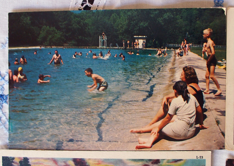
ΔΔ A good 50 or so years have passed since this photograph was taken. I like to imagine what all these people at the swimming pool are doing now, if they are still alive. I wonder what they remember about that day in the sun. (It's Camp Kanesatake at Spruce Creek, Pennsylvania. Did you happen to be there at some point in the 1960s or 70s? Is that YOU I see?)
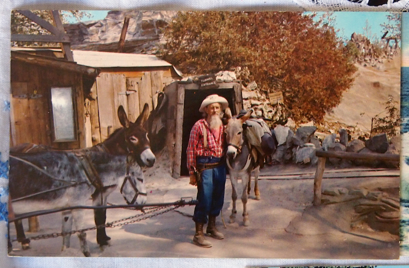
ΔΔ Ghost towns of America. I've visited one like this, and it was fascinating! I call this guy "dude with donkey" and he makes me smile. The caption on the back of the postcard is deliciously kitsch: "The Old Prospector // Accompanied by his faithful burros, the grizzled Old Prospector stands in front of the entrance to the Gold Mine tunnel."
ΔΔ Hand-drawn postcards are always sweet. But look at that car! It dates the card so perfectly.
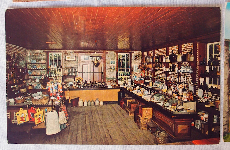
ΔΔ The back of this postcard tells us that this is the general store at the Deserted Village of Allaire in New Jersey. "Entering this store is like walking into the past," it says. Holding this postcard is ALSO like walking into the past.
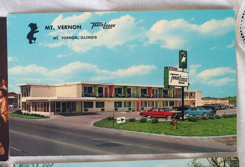
ΔΔ I love this because it is so fabulously dull. The good people of the Travel Lodge, Mt Vernon, Illinois, chose this photograph as the best way to advertise their hotel. On the back, it boasts all the latest amenities. "Direct Dial Telephones. Electric Heat." Take me there!
Only 975 to go...
Would you like to receive one of these postcards in the mail? I'd love to send you one. There's a form on this page for you to give me your mailing address (I'll never share it).