Painting hacks (and it's ok if you're not doing it right)

Recently when I wrote my frequently asked questions post, I deliberately neglected to answer one of the questions I get asked the most often… “Can you teach me how to paint?”
The truth is that I have never felt confident enough to ‘teach’ painting, because in order to teach something it helps if you actually know what you are doing yourself! I am completely self-taught when it comes to my illustrations, and by “self taught” I mean I just keep painting, experimenting and practising… I haven’t read any books or watched any YouTube videos to improve my techniques.
(Although I’m actually hoping to remedy that this year, and take some formal lessons in botanical illustration at the Botanical Gardens in Melbourne, so maybe one day in the future I’ll have something more useful to share on here.)
But in the meantime, rather than teach you how to paint in any strict, best-practise or rules-based way, I am going to share some of the tips, tricks, hacks and techniques that I have stumbled across so far on my illustration journey.

Why it’s ok to not do it right
Because I’ve never received proper training, it is highly possible that the things I share are not the best way to do things, or that I’m simply “not doing it right.” And I think it’s important that we all seek ways to feel comfortable with this, when it comes to our own creative work.
“Not doing it right” is why I’ve held back on sharing too much in terms of how-to-paint content in the past (fear that I’m not doing it right, and fear that I’d therefore be teaching you to ALSO not do it right).
But now I’m thinking differently, and I’m going to call myself out on this defeatist attitude. Really, it’s just another form of “imposter syndrome,” the feeling most of us experience sometimes (or often) - especially when it comes to creativity - that we are not good enough, even when others appreciate our creations - and that any minute, the world will see us for the failures we secretly believe we really are.
Why do our brains do this to us?? This blog is not the place to explore the depths of human psychology (although I do talk a lot about imposter syndrome and the Inner Critic in my Create with Confidence course), but today I will stand up to my own Inner Critic and hopefully bolster you to stand up to your own, by sharing my perfectly-imperfect tips for watercolour painting.
My hope? That you will a) find some tips in here that are useful, but b) even if nothing here is useful, that you will feel empowered to experiment, play and create, without the constraints of “doing it right.” Just go for it!
Ok, shall we get started?

1. It’s ok to pencil first
You know those Instagram and YouTube videos in which people deftly put wet brushes to clean, white paper and in a matter of minutes create beautiful floral wreaths or sleepy cats on cosy couches, or potted succulents in greenhouses full of charm?
Yep, I can’t do that either.
I sketch my picture out using pencil first (2B because anything darker becomes harder to rub out later), then use waterproof black pens (my preferred brand is Sakura Pigma Micron) to draw it exactly the way I want it to look. Depending on what I’m wanting for the finished product, I add in more or less pen detail, and when that’s done, I rub out the pencil marks.
By the time I come to do the painting, it’s really not much more than colouring in.
2. Painting tools (otherwise known as “You can get your paints from the supermarket”)
My father always used to tell me “It’s a poor workman who blames his tools,” and this is as true in the art-room as it is in the workshop, garden or kitchen. To whit: great tools can make life a lot easier, but they are no substitute for elbow-grease and practise.
For many years, I used sets of watercolours and gouache paints picked up in a toy-store and supermarket respectively. From time to time I still dip into my kids’ Crayola paints, and have used them for all kinds of projects, including illustrations I’ve been paid to create. Until two years ago, I was still using the used gouache paint set my grandmother gave me when I was 10 years old.
In case you’re wondering which is which:
Watercolour paints are made by mixing colour-pigment with binder. The paint is applied by wetting it and then brushing it onto paper. Once the water dries, the binder fixes the pigment to the paper. Watercolours are super-versatile because you can make the colour stronger or weaker depending on how much water you use, and you can easily blend them together or layer them over each other in-situ (i.e. on the painting itself) to create almost any colour or shade you want
Gouache paints are very similar to watercolour paints, except that an extra white pigment (like chalk) is added, to make them brighter and more opaque. (Think Toulouse-Lautrec posters and you’ll know what gouache looks like). You can also blend gouache and watercolour with one another to create just the right colour or intensity you want
Even now, my “best” paints are really hobby-grade paints (I have Winsor & Newton watercolours in a set and Reeves gouache in tubes). I’m sure an upgrade would be a good thing, but I haven’t made the plunge so far and, if you’re starting out and don’t have the means or desire to invest just yet, don’t let that stop you: some decent brushes (my favourites are 'Expression' brushes by Daller-Rowney) and a good feel for colour-blending are all you need to create lovely paintings.
Which leads me to…
3. Colour-blending 101
Alright, most of us know that there are only three primary colours (colours you can’t mix from others): red, yellow and blue. With the help of black and white, you can realistically create all the colours, shades and tones you need with just these basics.
Luckily for us, most paint sets come with a lot more options, so when we are ‘blending’, it’s to create subtlety and more realism. This is how I blend my colours:
First, I get a non-porous palette on which to mix my colours. I have an old plastic paint palette that used to belong to my grandmother, but anything non-porous will do. I also use dinner-plates, the plastic lids of my paints, anything I have handy at the time
Onto that palette, I add a small amount of the first colour, either by adding a lot of water (via my brush) to a hard colour in a paint set, or by squeezing a tiny bit of that colour from a tube
Next, I add my second colour to the palette - nearby but not touching the first - in the same way. And so on for any subsequent colours. So for example if I was making purple, I’d do this with blue and red.
Now I’ll bring a tiny bit of one colour into the middle, and a tiny bit of the other colour into the middle, and mix them together. Based on what that looks like, I’ll add little bits more of one or the other colour, until it looks right. At this point if necessary, I might bring in some other tones, for example a bit of yellow to give it warmth, or white to brighten it up, or a tiny bit of black to tone it down.
The trick is to do all of this gradually, one small bit of colour at a time, so that you can rectify any mistakes or any time you’ve overdone it with one colour, and build up slowly until you get exactly the shade you want.
If necessary, I test my blends on a scrap piece of paper, just to see how they look once they dry, and also to test how much water to add, to create the look I’m going for.
Once I’m happy, I use this new colour on my painting. If I find I’m running out, I start the process all over again but make sure to do it before the original blend has run out, so that I can match the shade as closely as possible so that my painting remains consistent.
4. Colour-blending combinations that come in handy
While travelling for five months I had only the smallest of travel-paint sets, so I had to do a lot more blending to get the colours I like, than I do at home. I am drawn to a muted colour palette with soft, natural tones. But my little travel paint-kit was full of bright and primary colours. Here are some of my personal thoughts on colour, and some of my favourite combinations to achieve the tones I love.
First of all, I have something to say about black. I’ve learned from experience that black can easily dominate a watercolour picture. Look around you: most of the things you think on first impressions are black are not actually true black - most likely they are a kind of dark grey, or a warm kind of black or a cool kind of black… do you see what I mean? For this reason, I almost never use actual black in my paintings (other than in the ink outlines). Instead, I either water it down heavily until it becomes a kind of grey, or I use this blend in the top row…
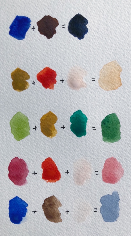
TOP ROW: The “sort-of black” here is achieved by blending dark blue and dark brown together. If I want a warmer black I add more brown, if I want it cooler I add more blue. Because it’s not “true black,” it looks more natural on the page.
SECOND ROW: I mix light-brown, orange and white together with a fair bit of water to create this kind of neutral sand, which forms the base for all kinds of other colours I need. It goes well with greens, and is also a good starting point for skin-tones, as it can go lighter, darker, or a touch pinker
THIRD ROW: I paint a lot of botanicals, but find the ready-made greens are often unnatural. Also, there are just so many shades of green in nature, just one or two won’t cut it. Depending on what I have to hand, I most often mix a lighter green with a darker green, and then play with adding either light brown, yellow, or the sand I created in the second row above, to get the right tone for the leaf I’m painting.
FOURTH ROW: I’m not a fan of “candy pink” but I love a duskier pink in everything from flowers to sunsets to balls of knitting and an old lady’s hat. I get this by blending the dark red in my paint set with a kind of fire-engine red/orange also in the set, and then adding white until I get the exact depth I want.
BOTTOM ROW: The dove blue/grey here is one of my favourite colours, and I get it by mixing royal blue (as opposed to the dark blue of the top row) with dark brown, and white. It is a much prettier and more natural sky than just watered-down blue, and by adding a tiny bit more brown I can turn it into a lovely, soft grey, that is nice for animal fur, for example, or to add shading and texture to the bark of trees.
(NOT PICTURED BUT HANDY): Purple is quite difficult to make. Most of us know to blend blue with red, but too much red and you quickly get brown instead. I try going lighter first: I’d probably blend the dusky-pink and dove-blue colours in the bottom two rows together, to create a soft kind of lilac, then I’d add more of any of the colours in those two rows bit by bit, in order to get the exact tone I wanted. For me, this is easier than starting from scratch with just red and blue.
4. How to shade a painting
One of the easiest ways to bring a painting to life is to add shading. This not only makes whatever you’re painting look more three dimensional, it also adds interest and texture to what you have created. Imagine a painting of a cactus in a terra-cotta pot. You could simply paint the pot a terra-cotta kind of orange, OR you could create shading to help it look round, rough-to-touch, and give it that lovely aged patina that real terra-cotta gets.
Here are some of my tips and hacks for shading a painting:
A consistent light-source
The most important thing is to imagine a consistent light-source. Imagine shining a spotlight on whatever it is you are painting, or imagine which way the sun is shining or where the window is. Keep that light-source consistent in your entire pattern. It will do all kinds of weird things to people’s brains if the shadows on one part of your picture are on the left, and in the other part they are on the right. Light doesn’t do that (unless you’re a surrealist painter).
It’s lighter where the light is (duh, Naomi)
If the light is coming from the right, everything on the right-hand side of your picture (from terra-cotta pots to trees to animals to a bottle of wine) will be lighter and brighter on the right, and darker on the left. If the light is shining straight in front of your thing (like your terra-cotta pot), then it will be lighter and brighter in the middle, and get darker on either side. If the light is coming from directly above, the leaves at the top of your plant will probably be lighter than those at the bottom.
Shadows are not only about light and dark
Shadows don’t have to be created by simply applying lighter and darker versions of the same colour. Here are some of the ways that I create shadows in order suggest a light-source and create interest:
a) By using more or less intensity of the same colour (by adding more water to make it less intense)
b) By putting a watery drop of dark-blue, black or dark-grey into the areas that I want to shadow, after applying the first ‘main’ colour
c) By blending up two versions of a colour, one that is darker and/or more intense for the areas that are to be in shadow (for example in the case of a terra-cotta pot, I will often blend up two versions of the neutral ‘sand’ colour I shared above, one that has slightly more light brown in it, and another with a bit more pink. The first will be my main ‘in the light’ colour, and the second will be the darker shadows)
d) By using a completely different colour for the shadows, which might be unexpected but, because it is darker or stronger than the lighter areas, still tells viewers’ brains: “this is shadow.”
e) By painting the object one colour, and then “blotting away” the part I imagine to be in the sun, by pressing a paper-towel down over that part. Pressing the paper towel down immediately will remove all the colour. Instead, I like to wait a short while (a minute or thereabouts) and then press - that will take away some of the intense colour, but leave a softer version.
What ever technique you use to create shadows, if you want to have a soft or even invisible transition between the light and shade sections, a good tip is to take a clean, wet paintbrush and gently brush water over those “transition lines.” I don’t always bother with this because sometimes I like things to look a bit more rough and deliberate, but you can create a very natural, organic transition from light to shade if you want to, just using water in this way.
Here are some examples of different ways I’ve created shadows:
In this partial painting of a castle in Dinan, I used a watery dark blue to create the shadows, despite there not actually being any “blue shadows” on the golden stone walls
In this painting of a whale I made for a Boots Paper greeting card, I used a rather unnatural aqua blue as the shading at the bottom of his belly. The brightness of the blue, and contrast to the much more washed out almost-white of his body, creates the shade I wanted, while also suggesting a watery “whale in ocean” feel that I wanted, despite not painting the ocean
In this greenhouse mail-art picture, I used three different blends on the terra cotta pots to show the light, middle and dark sections of the pots (and to add interest and texture), and blotted some of the way almost entirely, then added white paint, in the areas I wanted to appear super-light. (Here is another picture of pots in which I was - slightly - more subtle in the shading)

5. Paper, and paper towels
Paper weight
(As in, the weight of the paper, not the old-fashioned paperweight that your grandfather kept on his desk).
In general, it is best to paint with watercolours and gouache on paper that has been specially made for that purpose. Watercolour paint is thicker than ordinary paper, which helps to stop it from going bumpy and buckling with all that water. So to give you an idea:
Ordinary copy-paper is usually 80gsm (gsm just stands for “grams per square metre” and refers to the weight, or thickness, of the paper)
A fairly average watercolour paper thickness is 185gsm
Obviously, you can experiment to see what works for you. I have used copy paper plenty of times in my mail-art, and just flatten it down under books overnight if it buckles too much.
But if you pop into an art supplies store and ask to buy watercolour paper, it can be a little overwhelming. There’s weight, there’s texture, and there’s all those different methods of making the paper itself. How do you choose?
Here’s what I have experienced so far (although please remember - see the top of this longgggg blog post - that I am an amateur):
Rough, textured watercolour paper looks fantastic on those old watercolour landscape paintings you might have seen. It gives a lovely tactile feel to the painting
If you want to paint something for printing (such as something for a book or stationery, like my illustrations for Boots Paper), the texture might go against you, because it will stand out too much against the smoothness of the page elsewhere
Paper that is “hot pressed” gives you that smooth feel I’m talking about, and the other benefit is that the paint dries quite quickly on it so you can layer your colours on quickly
Paper that is “cold pressed” tends to be slightly more textured (though not necessarily as rough as the old-fashioned paper I mentioned earlier) so the paint stays wet longer if you want to create some effects using water and blends. (As an example of this, take a look at the image of food around a grey dinner plate I shared earlier: the dinner plate was left blank because a logo was going to be added inside it, but for subtle interest, I used a lot of water to create that slightly ‘bleeding’ effect you see, reminiscent of glazed pottery)
Most watercolour paper is either cream or white - think about what you mostly like to paint when you choose, and the tones you prefer. For my Boots Paper illustrations I use a slightly more creamy background, because that is what Boots’ owner, Brenner, prefers. For my own work I like a brighter white, because I prefer cooler tones
Preparing the paper
Confession: I never do this. I mean never. I have never even tried it. However… best practise is probably to stretch and then tape down watercolour paper, to ensure you have a perfectly flat surface, and that the paper doesn’t buckle with all the water you apply.
Perhaps if I painted more landscape-style images with big wash areas, I’d have felt the need to learn how to prepare my paper sooner, and have cultivated this good habit. Because my illustrations are mostly quite small, it hasn’t been an issue (so far).
If you want to learn how to prepare your paper (or want to teach me), here’s a tutorial.
Paper towels
My favourite painting tool, other than paints, brushes and water, is a trusty paper towel. My favourites are the kinds that have little patterns embossed on them. I always have one or two paper towels beside me when I paint, and I use them to:
Clean brushes (after I’ve cleaned them in water, I wipe them off on paper towels to be sure they don’t have any paint residue left on them)
Blot away mistakes (if the paint is still wet, you can blot it with a paper towel and you are magically back to blank paper! Even if the paint has partly dried, try wetting it thoroughly with a brush, then blotting)
Blot sections of an image to create a feeling of light and shade, as I mentioned above
Create texture. If there are embossed patterns on the paper towel, it can be fun to actually use this in my painting: I press the paper towel over the paint while it is not quite dry (but not super wet or the paint will disappear) to create a fun, mottled pattern
Here is a short video in which I use a paper towel to create light and shade in my picture, let the paint partially dry (while I sip tea, naturally), then create a new layer in a different colour.

I hope this blog post was useful! I feel a little bit silly and vulnerable writing about “how to” on something I really do just muddle through, and feel about as far from being an expert as you can possibly imagine.
This lack of training probably makes me a fairly poor instructor: if there was something you were wanting to know from me about how I do my painting, but I’ve failed to mention it here, feel free to ask away. Likewise, if this actually is useful to you and you’d like to know more (such as some tips on drawing, for example, which in all honesty would be equally bumbled-through), let me know and I’ll see what I can come up with.
But no matter what, I DO hope this long post inspires you to pick up that dusty old paint-set (yes, the one you picked up for your kids at the supermarket) and wile away an afternoon playing with colour.